A straw wrapper is a very small piece of packaging with an unusually demanding job. It must open easily, protect the straw during the intended handling route and carry a readable brand message on a narrow surface. The artwork may look excellent on a large monitor and still fail once the paper is folded, sealed and held in a customer's hand.
For buyers ordering custom printed straws, the most valuable approval is therefore not a screenshot saying “looks good.” It is a controlled proof that connects the artwork to the actual wrapper material, finished dimensions and production method. This article explains where that approval should focus, what a digital proof can establish and when a physical sample is worth the additional step.
Begin with the finished wrapper, not the logo file
Ask for the supplier's current dieline for the exact straw and wrapping format. A dieline should distinguish the finished area, seals, fold or overlap zones and the safe area for important content. Confirm the orientation of the straw and the intended opening direction. Do not reuse a layout from a previous supplier unless the new manufacturer has checked it against the current wrapping setup.
The wrapper is part of a system. Increasing the straw diameter may change the required wrapper width; changing the length affects the space available for the design and the end seals. This is why artwork should not be treated as the first technical decision. Approve the physical product specification, then lock the artwork to that version.
Use a simple file name that identifies product, language, revision and date. A folder containing “final.pdf,” “final-new.pdf” and “final-really-final.pdf” is an avoidable production risk. The purchase order should reference the approved revision, not merely “the logo sent by email.”
Decide what the wrapper actually needs to say
Start with a hierarchy: brand first, necessary product or handling information second, optional promotional material third. A narrow wrapper cannot carry the same information load as an outer box. If text becomes too small to read comfortably on a physical printout, move nonessential information to the box or an accessible landing page.
Check punctuation, accented characters, units and contact details at the intended print size. For bilingual or trilingual layouts, do not shrink every language until they fit. Consider separate artwork versions or a shorter, accurately translated message. Arabic text requires correct shaping and direction; a row of disconnected letters can look decorative to someone who cannot read it while being unusable to the intended customer.
Environmental claims deserve a separate review. The wrapper's disposal route may differ from the straw's, and a certification mark must be used within its authorization and scope. Keep a claim register showing the wording, evidence and approving person. An attractive icon should never substitute for that decision.
Separate three kinds of proof
| Proof type | Useful for checking | What it does not establish by itself |
|---|---|---|
| Digital layout proof | Wording, position, orientation, version | Final colour or sealing behaviour |
| Colour reference or agreed proof | Intended colour appearance under agreed conditions | Every variation of the production run |
| Finished physical sample | Readability, folds, seals, opening and handling | Ongoing compliance of future batches |
Fogra distinguishes a controlled contract proof from an ordinary colour printout in its prepress certification guidance. For a straw-wrapper order, the practical lesson is to define what the supplied proof represents. A PDF viewed on an uncalibrated laptop should not become an unspoken promise of an exact printed colour.
prepress certification guidance
Not every small order needs a formal contract proof. The appropriate approval route depends on brand sensitivity, number of colours, substrate and commercial risk. Ask the printer what it can reproduce and how a disputed colour would be assessed. Agree that reference before paying for a large printed run.

The paper changes the result
White and natural-coloured substrates can make the same ink appear different. Surface texture, absorbency and the printing process also affect fine details. A delicate line that works in a digital advertisement may be a poor choice for a small wrapper. Ask the supplier to identify its practical limits for small text, reverse text and narrow gaps in the logo.
Avoid prescribing a universal minimum font size from an online checklist. Readability depends on the typeface, weight, contrast, printing method and actual size. Print the layout at 100 percent, inspect it at normal reading distance and ask the supplier to flag elements that are difficult to hold consistently in production.
The outside print still needs a suitable food-contact packaging assessment. EuPIA's guidance on printing-ink migration testing addresses migration considerations for inks and varnishes used in food-contact materials. In purchasing terms, ask the supplier to explain the ink and packaging compliance basis for the proposed construction, including the relevant contact and storage conditions.
guidance on printing-ink migration testing
Review a physical sample in the way customers will use it
Open several wrappers rather than admiring one. Look for a usable opening, paper fragments, torn printing and a straw that can be removed without unnecessary handling of the mouth-contact end. Check the wrapper after normal packing and transport handling as well as immediately after printing.
Then place it in the actual service setting: a takeaway bag, a hotel tray or a counter dispenser. A logo positioned beautifully on a flat sheet can disappear in a fold or sit against the tray. Photograph both sides of the finished wrapper and the opening action, and retain those images with the approval record.
If a QR code is included, scan the finished print on more than one phone under realistic lighting. Check the destination page, language and mobile usability. A working code that leads to an outdated campaign is still a failed customer experience. Keep the destination stable or use a redirect that the business controls.
Build a short approval record
Record the product code, wrapper material, finished dimensions, artwork revision, ink references, approved proof type and any accepted limitations. Add clear photographs where appearance matters. Separate a spelling correction from a change to the product specification so that everyone knows which approvals must be repeated.
For example, moving a logo away from a seal may require a new layout proof. Changing the paper or printing process can require broader checks. A short change log is more useful than an email thread in which an old attachment can easily be mistaken for the current version.
Plan the order around the customization threshold
HiStraws offers custom wrapper printing from 2,000 straws. Custom straw dimensions and laser logos each start at 10,000. Confirm quantities per design and material with the quotation; combining several artwork versions can affect setup and production planning. Outer boxes and special tooling should be scoped separately.
Before requesting a price, send the logo file, intended language, destination market, quantity and straw dimensions. If the design is still developing, say so. The useful next step is an agreed dieline and proof route, followed by a sample review where needed. That sequence turns a small wrapper into a controlled part of the order instead of a last-minute source of rework.
Research and purchasing analysis by HiStraws. Sources checked on 27 September 2026. Worked examples are illustrative, not price quotations or laboratory results.
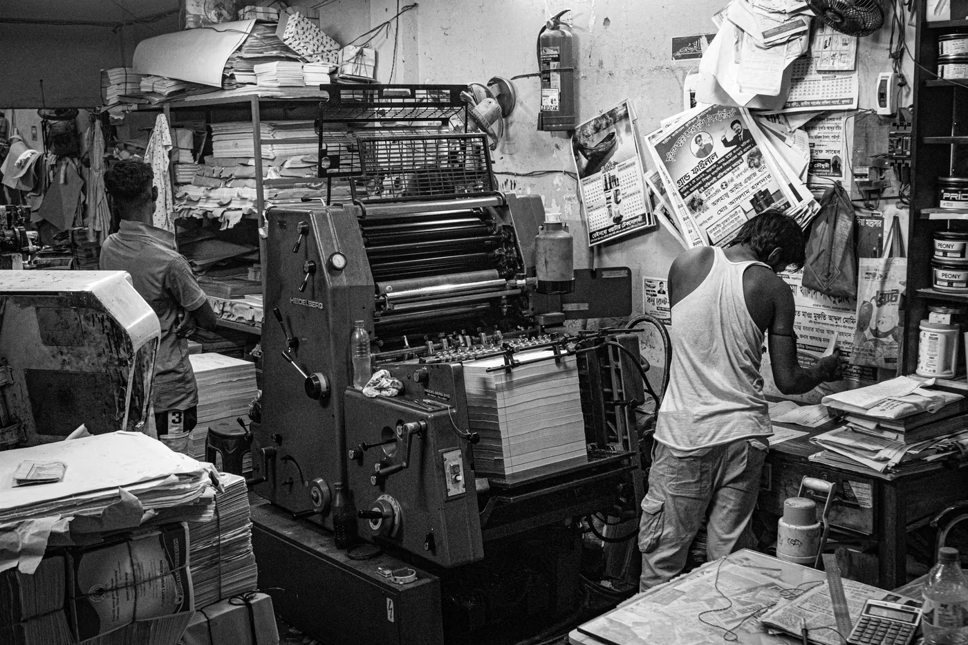
Licensed reference photography. Images do not establish product composition, certification or ownership of the depicted facilities.